- Go 92.1%
- JavaScript 7%
- HTML 0.4%
- Shell 0.3%
- Makefile 0.2%
| docs | ||
| eg | ||
| magicform | ||
| style | ||
| theme | ||
| .gitignore | ||
| button.go | ||
| check_button.go | ||
| checkbox.go | ||
| colorpicker.go | ||
| debug.go | ||
| docs.go | ||
| dragdrop.go | ||
| enums.go | ||
| frame.go | ||
| frame_pack.go | ||
| frame_place.go | ||
| functions.go | ||
| glyphs.go | ||
| go.mod | ||
| go.sum | ||
| image.go | ||
| label.go | ||
| LICENSE.md | ||
| listbox.go | ||
| main_window.go | ||
| menu.go | ||
| menu_bar.go | ||
| menu_button.go | ||
| menu_test.go | ||
| pager.go | ||
| README.md | ||
| scrollbar.go | ||
| selectbox.go | ||
| supervisor.go | ||
| tabframe.go | ||
| theme.go | ||
| tooltip.go | ||
| tooltip_test.go | ||
| version.go | ||
| widget.go | ||
| window.go | ||
| window_manager.go | ||
| window_test.go | ||
ui: User Interface Toolkit for Go

Package ui is a user interface toolkit for Go that targets desktop applications (SDL2, for Linux, MacOS and Windows) as well as web browsers (WebAssembly rendering to an HTML Canvas).
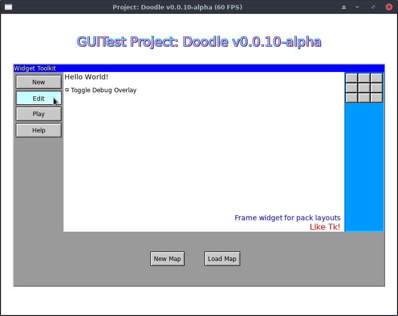
(Screenshot is from Sketchy Maze's GUITest debug screen showing a Window, several Frames, Labels, Buttons and a Checkbox widget.)
It is very much a work in progress and may contain bugs and its API may change as bugs are fixed or features added.
This library is being developed in conjunction with my drawing-based maze game, Sketchy Maze. The rendering engine library is at go/render which provides the SDL2 and Canvas back-ends. (GitHub mirror: kirsle/render)
Notice: the canonical source repository for this project is at git.kirsle.net/go/ui with a mirror available on GitHub at SketchyMaze/ui. Issues and pull requests are accepted on GitHub.
Example
See the eg/ directory in this git repository for several example programs and screenshots.
package main

import (
    "fmt"

    "git.kirsle.net/go/render"
    "git.kirsle.net/go/ui"
)

func main() {
    mw, err := ui.NewMainWindow("Hello World")
    if err != nil {
        panic(err)
    }

    mw.SetBackground(render.White)

    // Draw a label.
    label := ui.NewLabel(ui.Label{
        Text: "Hello, world!",
        Font: render.Text{
            FontFilename: "../DejaVuSans.ttf",
            Size:         32,
            Color:        render.SkyBlue,
            Shadow:       render.SkyBlue.Darken(40),
        },
    })
    mw.Pack(label, ui.Pack{
        Side: ui.N,
        PadY:   12,
    })

    // Draw a button.
    button := ui.NewButton("My Button", ui.NewLabel(ui.Label{
        Text: "Click me!",
        Font: render.Text{
            FontFilename: "../DejaVuSans.ttf",
            Size:         12,
            Color:        render.Red,
            Padding:      4,
        },
    }))
    button.Handle(ui.Click, func(p render.Point) {
        fmt.Println("I've been clicked!")
    })
    mw.Pack(button, ui.Pack{
        Side: ui.N,
    })

    // Add a mouse-over tooltip to the button.
    ui.NewTooltip(button, ui.Tooltip{
        Text: "You know you want to click this button",
        Edge: ui.Right,
    })

    mw.MainLoop()
}
Widgets and Features
The following widgets have been implemented or are planned for the future.
Widgets are designed to be composable, making use of pre-existing widgets to create more complex ones. The widgets here are ordered from simplest to most complex.
Fully implemented widgets:
In order of simplicity:
- BaseWidget: the base class of all Widgets.
- The
Widgetinterface describes the functions common to all Widgets, such as SetBackground, Configure, MoveTo, Resize, and so on. - BaseWidget provides sane default implementations for all the methods required by the Widget interface. Most Widgets inherit from the BaseWidget and override what they need.
- The
- Frame: a layout wrapper for child widgets.
- Pack() lets you add child widgets to the Frame, aligned against one side or another, and ability to expand widgets to take up remaining space in their part of the Frame.
- Place() lets you place child widgets relative to the parent. You can place it at an exact Point, or against the Top, Left, Bottom or Right sides, or aligned to the Center (horizontal) or Middle (vertical) of the parent. Example
- Label: Textual labels for your UI.
- Supports TrueType fonts, color, stroke, drop shadow, font size, etc.
- Variable binding support: TextVariable or IntVariable can point to a string or int reference, respectively, to provide the text of the label dynamically.
- Image: show a PNG or Bitmap image on your UI.
- Button: clickable buttons.
- They can wrap any widget. Labels are most common but can also wrap a Frame so you can have labels + icon images inside the button, etc.
- Mouse hover and click event handlers.
- CheckButton and RadioButton
- Variants on the Button which bind to a variable and toggle its state when clicked. Boolean variable pointers are used with CheckButton and string pointers for RadioButton.
- CheckButtons stay pressed in when clicked (true) and pop back out when clicked again (false).
- RadioButtons stay pressed in when the string variable matches their value, and pop out when the string variable changes.
- Checkbox and Radiobox: a Frame widget that wraps a
CheckButton and a Label to provide a more traditional UI element.
- Works the same as CheckButton and RadioButton but draws a separate label next to a small check button. Clicking the label will toggle the state of the checkbox.
- TabFrame: a collection of Frames navigated between using a row of tab buttons along their top edge. Example.
- Pager: a series of numbered buttons to use with a paginated UI. Includes "Forward" and "Next" buttons and buttons for each page number.
- Window: a Frame with a title bar Frame on top.
- Can be managed by Supervisor to give Window Manager controls to it (drag it by its title bar, Close button, window focus, multiple overlapping windows, and so on). Example
- Tooltip: a mouse hover label attached to a widget. Example
- MenuButton: a button that opens a modal pop-up menu on click.
- MenuBar: a specialized Frame that groups a bunch of MenuButtons and provides a simple API to add menus and items to it.
- Menu: a frame full of clickable links and separators. Usually used as a modal pop-up by the MenuButton and MenuBar. Example
- SelectBox: a kind of MenuButton that lets the user choose a value from a list of possible values.
- Scrollbar: a Frame including a trough, scroll buttons and a draggable slider.
- ListBox: a multi-line select box with a ScrollBar that can hold arbitrary child widgets (usually Labels which have a shortcut function for).
Some useful helper widgets:
- ColorPicker: a ui.Window popup that lets the user choose a color value. It shows a graphical gradient they can click on and an ability to enter a custom hexadecimal value by hand (needs assistance from your program). Example
Planned widgets:
- TextBox: an editable text field that the user can focus and type a value into.
- TextArea: an editable multi-line text field with a scrollbar.
Supervisor for Interaction
Some widgets that support user interaction (such as Button, CheckButton and Checkbox) need to be added to the Supervisor which watches over them and communicates events that they're interested in.
func SupervisorSDL2Example() {
    // NOTE: using the render/sdl engine.
    window := sdl.New("Hello World", 800, 600)
    window.Setup()

    // One Supervisor is needed per UI.
    supervisor := ui.NewSupervisor()

    // A button for our UI.
    btn := ui.NewButton("Button1", ui.NewLabel(ui.Label{
        Text: "Click me!",
    }))

    // Add it to the Supervisor.
    supervisor.Add(btn)

    // Main loop
    for {
        // Check for keyboard/mouse events
        ev, _ := window.Poll()

        // Ping the Supervisor Loop function with the event state, so
        // it can trigger events on the widgets under its care.
        supervisor.Loop(ev)
    }
}
You only need one Supervisor instance per UI. Add() each interactive widget to it, and call its Loop() method in your main loop so it can update the state of the widgets under its care.
The MainWindow includes its own Supervisor, see below.
Window Manager
The ui.Window widget provides a simple frame with a title bar. But, you can use the Supervisor to provide Window Manager controls to your windows!
The key steps to convert a static Window widget into one that can be dragged around by its title bar are:
- Call
window.Supervise(ui.Supervisor)and give it your Supervisor. It will register itself to be managed by the Supervisor. - In your main loop, call
Supervisor.Loop()as you normally would. It handles sending mouse and keyboard events to all managed widgets, including the children of the managed windows. - In the "draw" part of your main loop, call
Supervisor.Present()as the final step. Supervisor will draw the managed windows on top of everything else, with the current focused window on top of the others. Note: managed windows are the only widgets drawn by Supervisor; other widgets should be drawn by their parent widgets in their respective Present() methods.
You can also customize the colors and title bar controls of the managed windows.
Example:
func example() {
    engine, _ := sdl.New("Example", 800, 600)
    supervisor := ui.NewSupervisor()

    win := ui.NewWindow("My Window")

    // Customize the colors of the window. Here are the defaults:
    win.ActiveTitleBackground = render.Blue
    win.ActiveTitleForeground = render.White
    win.InactiveTitleBackground = render.DarkGrey
    win.InactiveTitleForeground = render.Grey

    // Customize the window buttons by ORing the options.
    // NOTE: Maximize behavior is still a work in progress, the window doesn't
    //       redraw itself at the new size correctly yet.
    // NOTE: Minimize button has no default behavior but does trigger a
    //       MinimizeWindow event that you can handle yourself.
    win.SetButtons(ui.CloseButton | ui.MaximizeButton | ui.MinimizeButton)

    // Add widgets to your window.
    label := ui.NewLabel(ui.Label{
       Text: "Hello world!",
    })
    win.Pack(label, ui.Pack{
        Side: ui.W,
    })

    // Compute the window and its children.
    win.Compute(engine)

    // This is the key step: give the window to the Supervisor.
    win.Supervise(supervisor)

    // And in your main loop:
    // NOTE: MainWindow.MainLoop() does this for you automatically.
    for {
        ev, _ = engine.Poll()  // poll render engine for mouse/keyboard events
        supervisor.Loop(ev)
        supervisor.Present(engine)
    }
}
See the eg/windows/ example in the git repository for a full example, including SDL2 and WebAssembly versions.
MainWindow for Simple Applications
The MainWindow widget may be used for "simple" UI applications where all you want is a GUI and you don't want to manage your own SDL2 (or Canvas) engine.
MainWindow is only to be used one time per application, and it sets up its own SDL2 render context and creates the main window. It also contains a Frame widget for the window contents and you may Pack() widgets into the window the same as you would a Frame.
MainWindow includes its own Supervisor: just call the .Add(Widget)
method to add interactive widgets to the supervisor. The MainLoop() of the
window calls Supervisor.Loop() automatically.
License
MIT.